Federal Communications Commission website redesign focused primarily on reorganizing header navigation content by reworking the information architecture and layout. Additional work included modernizing visual elements of the entire site.
TEAM MEMBERS
ASIA ASBERRY
MY ROLE
USER RESEARCHER
USER EXPERIENCE DESIGNER
USER INTERFACE DESIGNER
TOOLS USED
ADOBE XD
ADOBE pHOTOSHOP
Adobe Color
Accessible-colors.com contrast checker
MIRO
TIMELINE
SEPTEMBER 5, 2020 - September 19, 2020
BACKGROUND
WHAT IS The Federal Communication Commission?
The Federal Communications Commission (FCC) regulates interstate and international communications by radio, television, wire, satellite, and cable in all 50 states, the District of Columbia and U.S. territories. An independent U.S. government agency overseen by Congress, the Commission is the federal agency responsible for implementing and enforcing America’s communications law and regulations (FCC.gov).
WHY I CHOSE the FCC
I was really excited to be able to redesign a government website given that I have years of experience working for another government agency, the CDC. After becoming pretty familiar with other government websites over the years (especially CDC’s website), it was pretty clear to me that many of them could benefit from not only an aesthetic redesign but also a complete rework of their information architecture. Additionally, I worked in a role doing communications so naturally, the FCC interested me.
PROBLEM
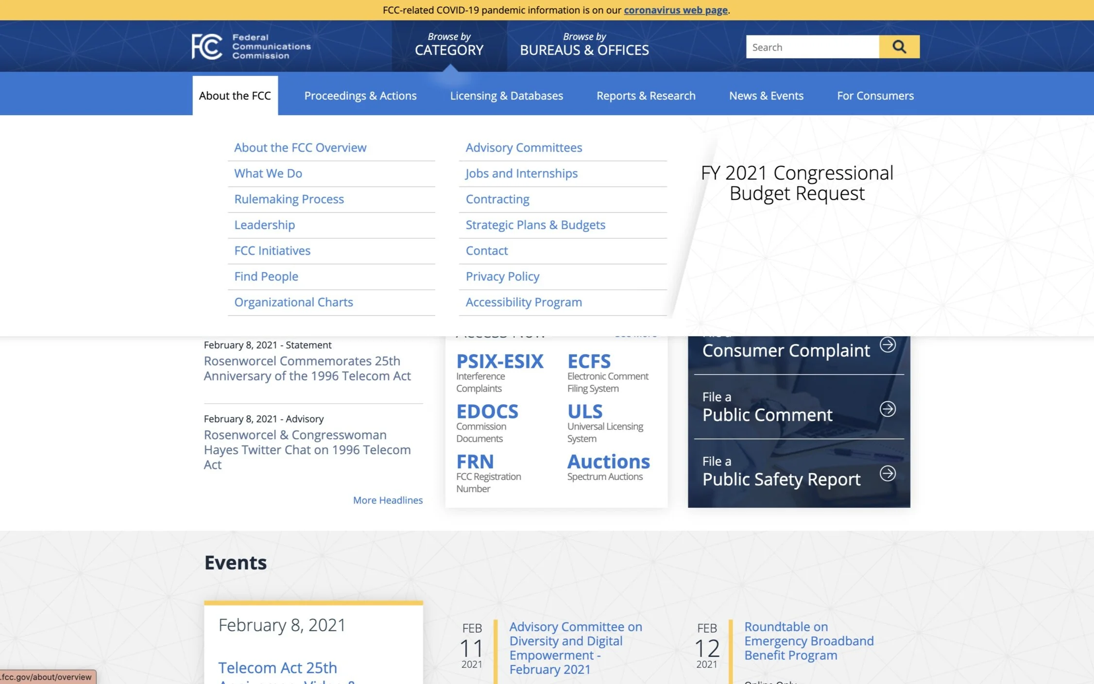
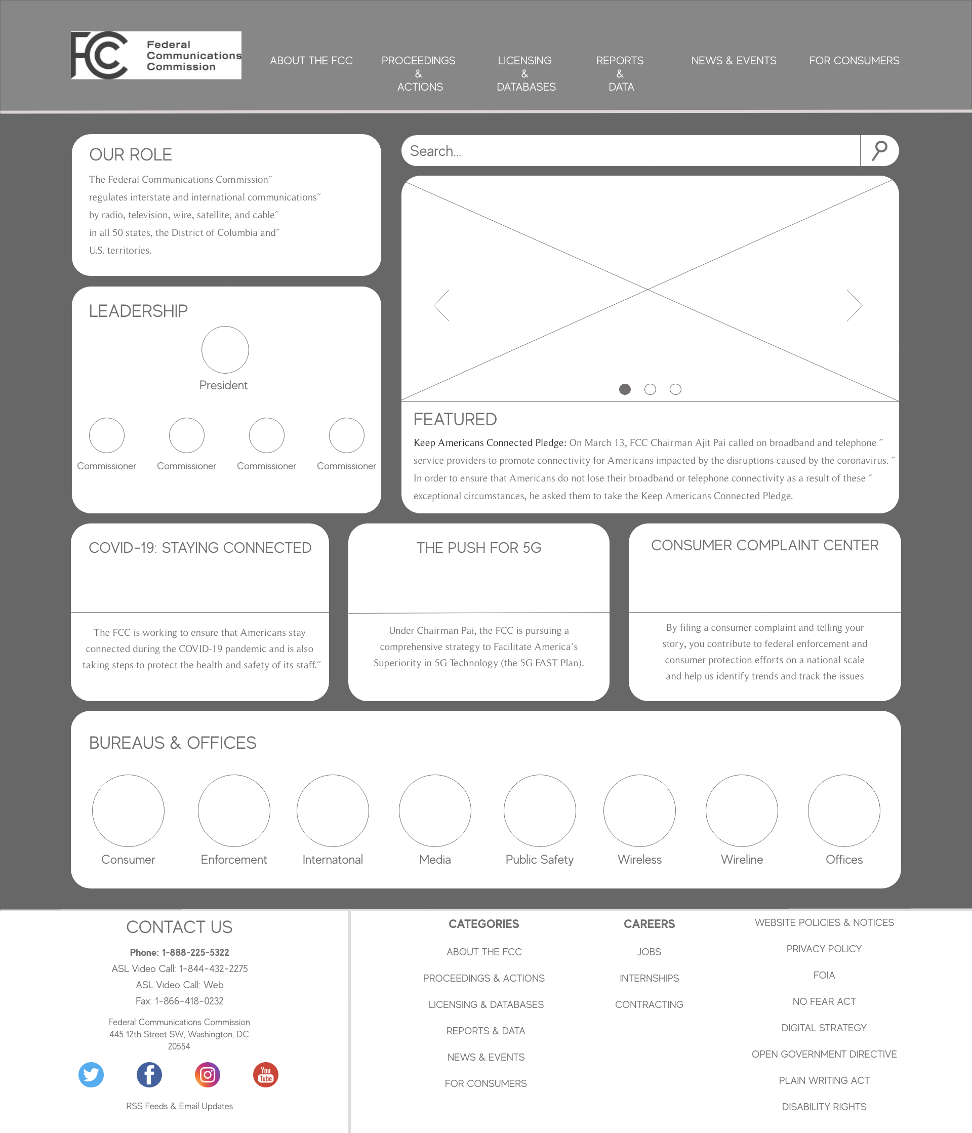
As a new user to the FCC website and the agency itself, I was unsure of what exactly it did. Upon going to the website to understand a little more about what they did, I quickly discovered it was going to be a little more difficult than I thought.
I expected the homepage to provide context as to what the core responsibilities and functions of the FCC were but it seemed that you already needed to have a pretty in depth understanding of what the FCC does to even understand the homepage.
FCC homepage
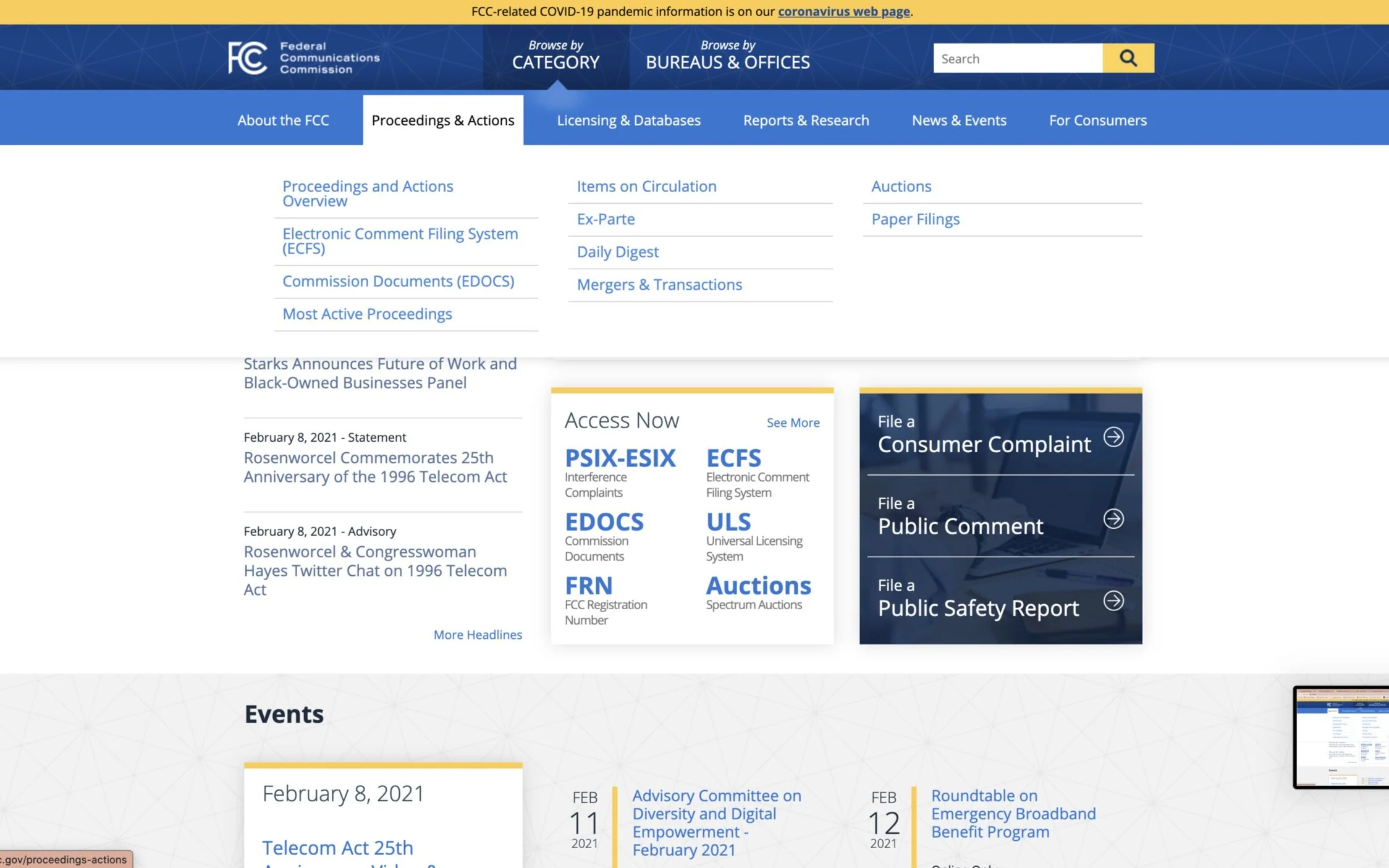
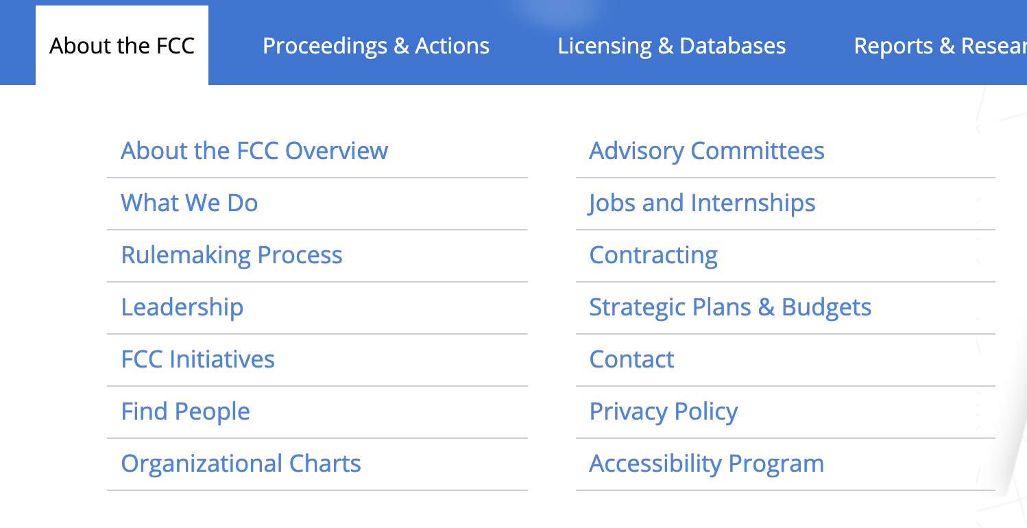
The next most glaring issue was the organization of information within the navigation bar. There were so many options to choose from that it made it difficult to figure out where to start. Seeing as though it was difficult for me to scroll through the nav bar, I knew that this definitely was a feature that needed to be user tested.
Overall, it seemed like the most important information was hidden or not made obvious to the user.
Research
Proto-persona
I started with a proto-persona to help me understand what the average user of the FCC website might be like. Robert Lancaster is a producer for TBS who uses the FCC website to remain current on regulations and guidance for most effective communication methods for TBS.
User testing
Based on the aforementioned issues with the FCC website and additional issues I found, I decided to test 5 users on the below 3 tasks.


Why these tasks?
Task 1: The reasoning behind testing the first task was due to the fact that the contact information on the bottom of the site did not immediately stand out to me when I looked for it. However, users did not struggle with this task and all 5 of them found the contact information easily
Task 2: The justification for task 2 was a little more interesting. As stated before, when I came to the FCC’s website for the first time, I struggled to understand the purpose of the agency. After navigating the site, I found 2 different paragraphs (one on the “About the FCC Overview” page and one on the “What We Do” page) explaining the function of the FCC - both with very similar but different wording.

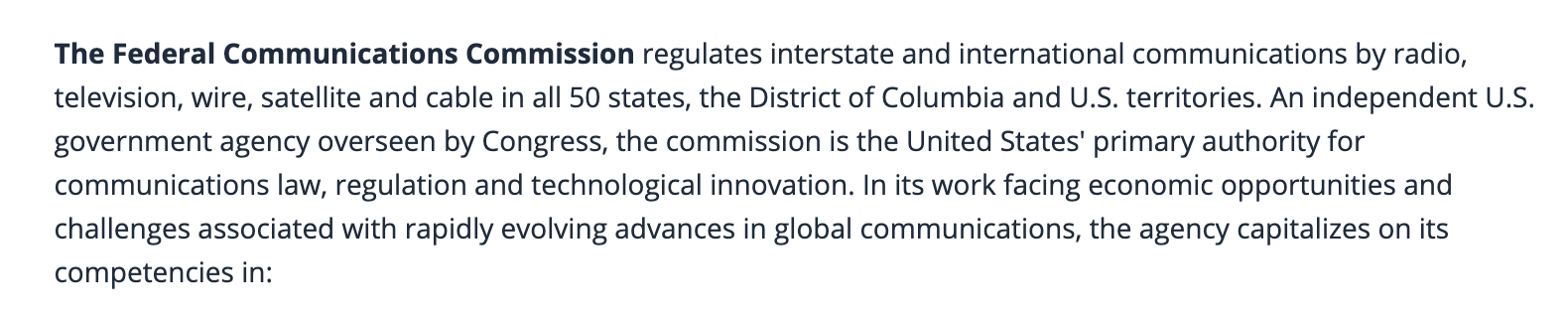
I initially didn’t know which one was actually describing what the FCC’s purpose was or if BOTH were saying the same thing. I read both paragraphs a few times over before I realized they essentially were saying the same thing. This was immediately confusing to me and made me ask:
“Why do they have (more or less) the same paragraph on two different pages?”
“Why not just use the same paragraph if they say the same thing?”
“Is there a need for both the “About the FCC Overview” page AND the “What We Do” pages if they essentially say the same thing?
These points of confusion drove me to see if other users would experience these same trains of thought. As you can see above, while all 5 users found the paragraphs detailing the functions of the FCC, 3/5 (60%) experienced confusion about which paragraph counted as the actual definition of the purpose of the FCC.
Task 3: Since our proto-persona, Robert, works for TBS, I wanted to see what people who worked in media could gain from the FCC website. After having some difficulty navigating the site to find media-relevant information, I finally spotted the link at the bottom of the page for the bureau on media. I thought the process to find this link was unnecessarily difficult. After a few more minutes of browsing, I realized that my eyes completely over looked the large “Browse by Bureau” option at the very top of each page. Despite the size and position of this tab, it was virtually invisible. I decided to test my users to see if they would have equal difficulty in finding the “Media Bureau” page.
Users had a very similar experience to mine which proved to me that this was a detail that needed to be improved upon in my redesign. 4/5 users eventually found the correct page but tried various methods before they got there. Only 1 gave up completely.
Accessibility testing
In additional to testing the ease of navigating the content on the website, it was important to test the accessibility of the colors and contrast on the website. Using the 5 main website colors, I ran the colors through accessible-colors.com to investigate whether the current color palette was visually accessible which seemed particularly important for an agency who pushes for clear, accessible communication for all (see FCC’s Accessible Communications for Everyone initiative). As shown below, many of the colors did not pass AA or AAA standard for accessibility. Accessible colors will be addressed more in the PROTOTYPING section of this case study.
Information architecture
Redlining
As shown in the navigation screenshots in the PROBLEM section, the FCC’s content organization showed room for improvement. The header and footer navigation links were redlined and annotated with comments on potential usability pain points and improvements to visual principles.


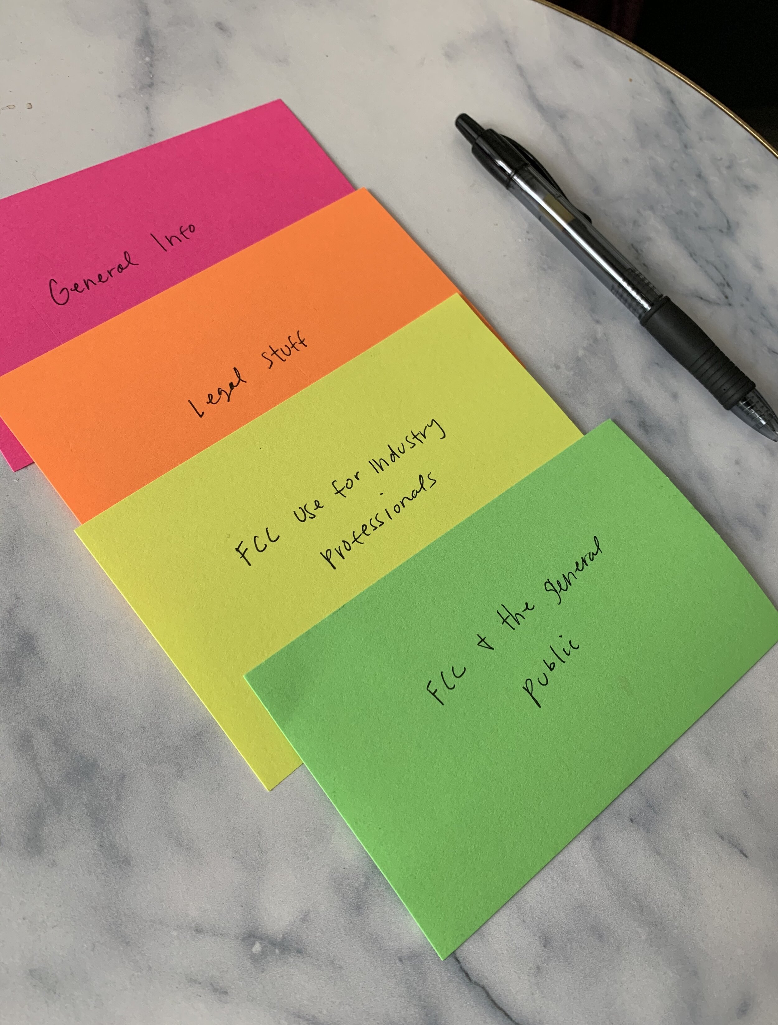
Card sorting
To tackle the navigation reorganization, I used card sorting to separate out each individual link within the navigation and organize, remove, or combine them according to how they made sense to me. Approximately 120 cards were created from the individual navigation links in the FCC header and footer. They were categorized into 4 types of information:
General info
Legal stuff
FCC use for industry professionals
FCC and the general public

Site map
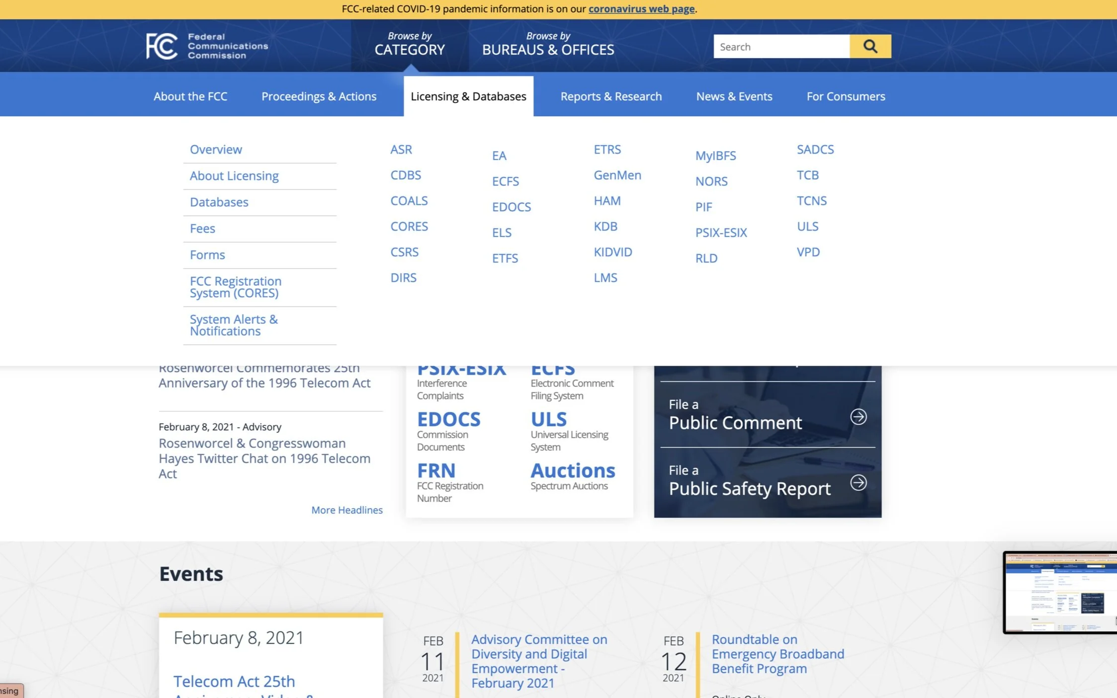
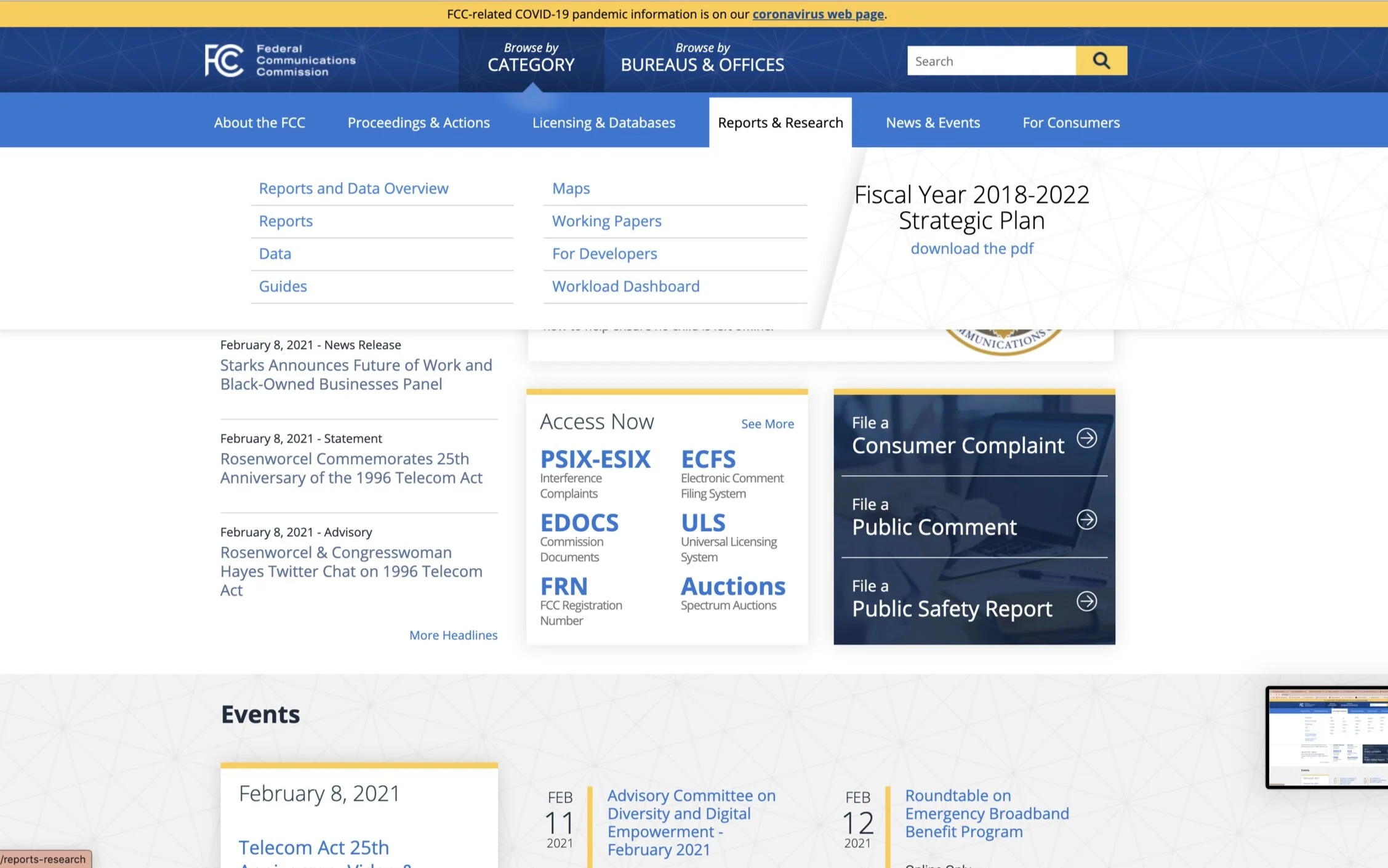
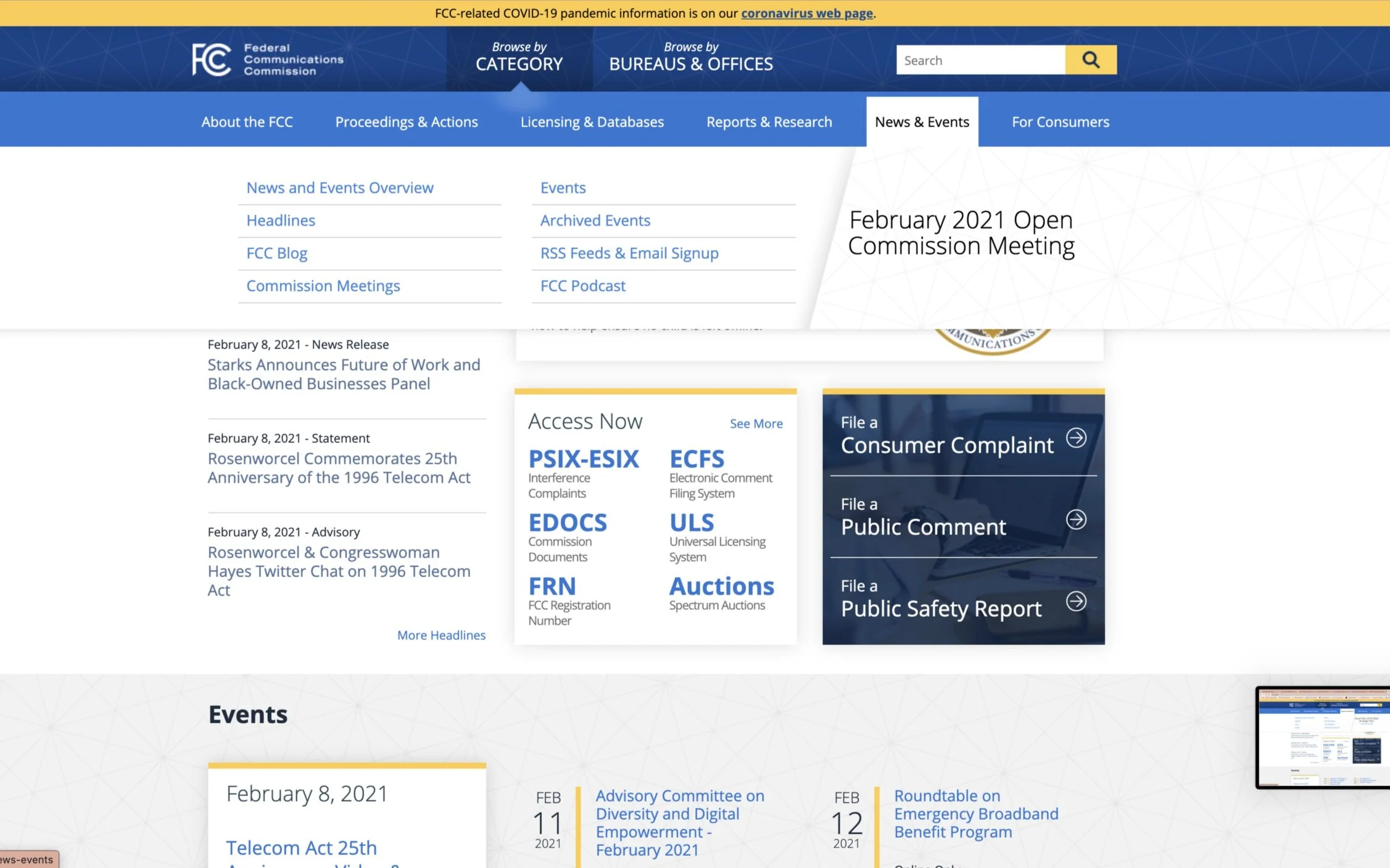
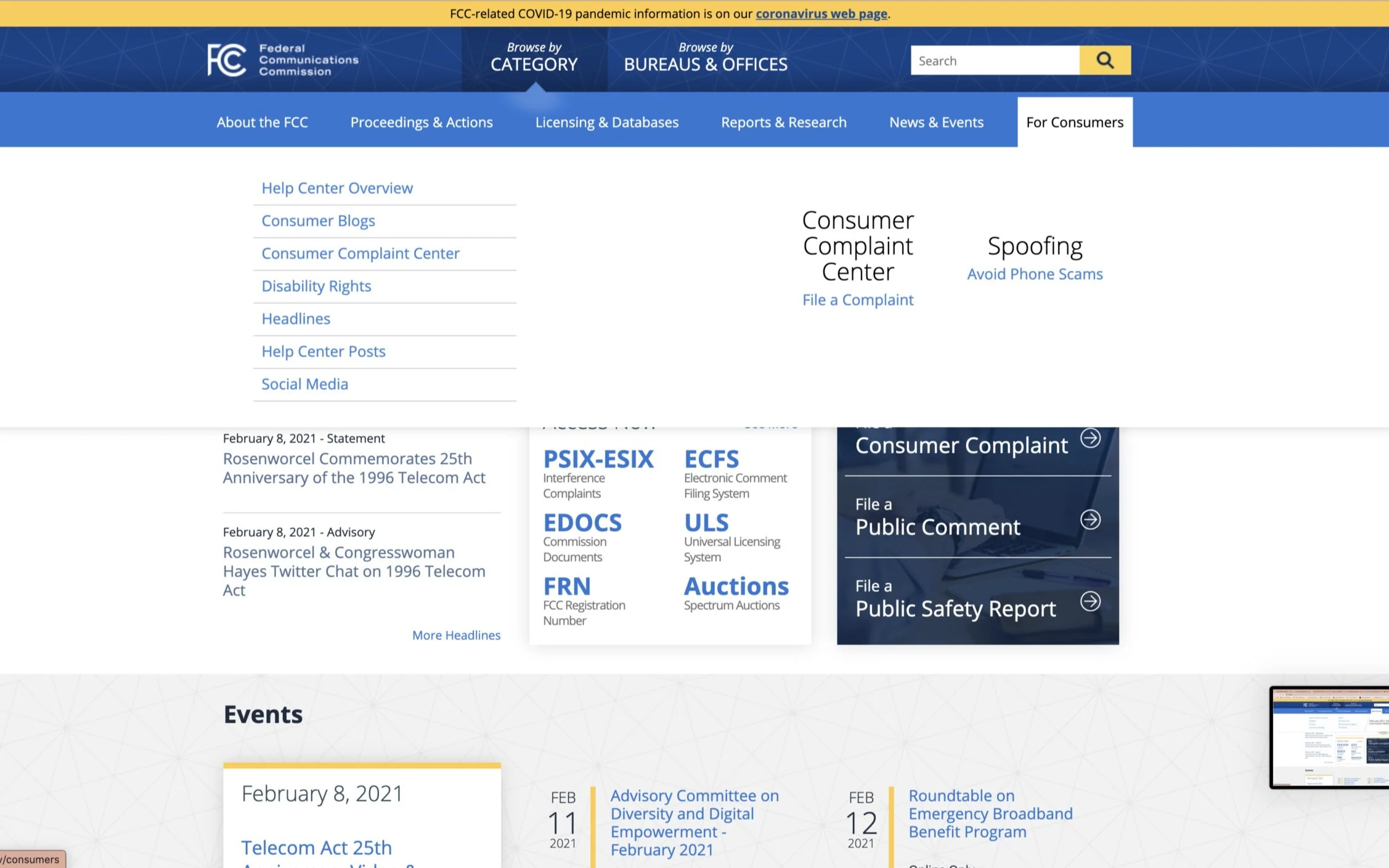
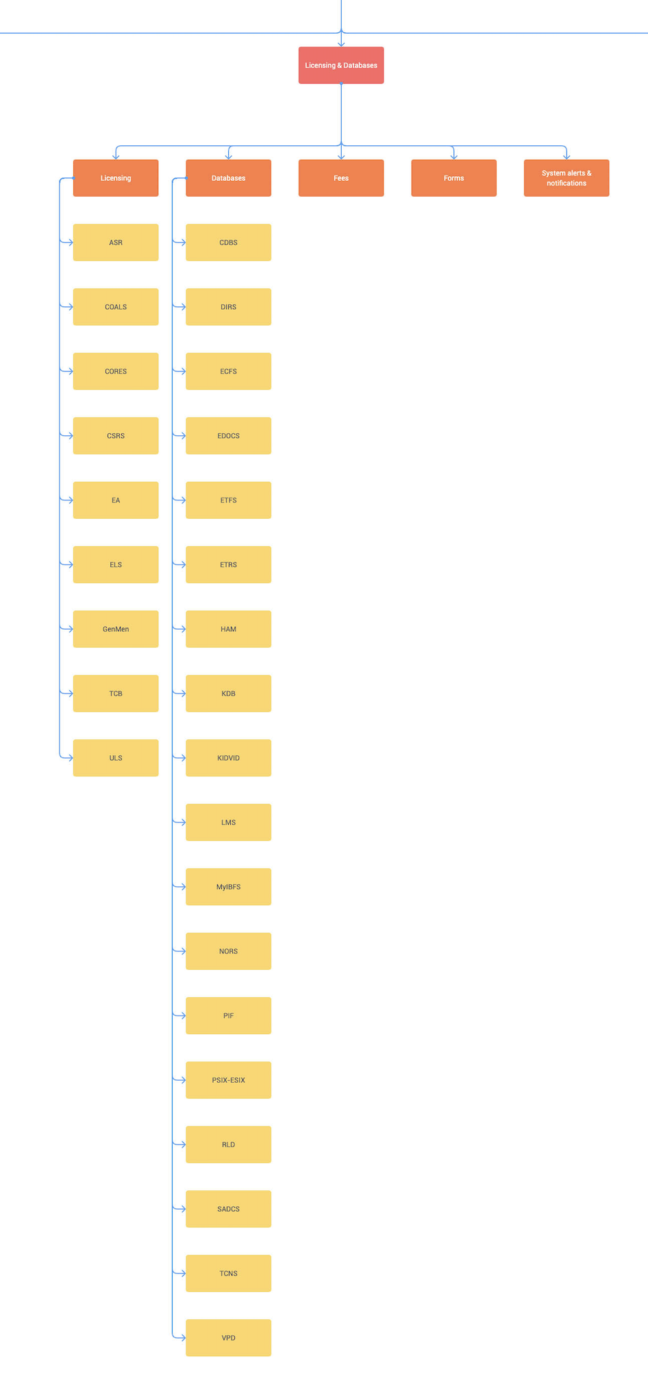
Using the structure I created during the card sort, I created a new site map for the FCC website. The header navigation was rearranged to better consolidate like information together and to remove redundant information. Reorganizing the navigation also helped to make important links more easily seen.
Major changes to the navigation include:
Removal of overview section on each header tab
Bureaus are now found under organizational charts section of About the FCC tab
Contact information is now found under About the FCC tab
Condensing of information within each tab (ex: About the FCC tab now has 6 secondary links vs. the original 14)
Licensing & Databases tab separates and classifies licensing systems from database systems
Decision to add search bar (in wireframes)


Prototyping
Wireframing
There were 2 goals I wanted to accomplish in terms of the new website’s aesthetics:
Improving ease of navigation
Giving it a professional and modern feel
To do this, I continued with the sitemap organization from above and decided on a navigation that pulled from the left instead of a dropdown. To put more emphasis on visual/information hierarchy, I used buttons for each category within each tab — the current category being the biggest button and the secondary options being smaller with a left indent and a different shade.


Using the same styles from my desktop wireframes, I created responsive mobile wireframes.
I organized the navigation into a hamburger menu that when clicked covers the entire viewport due to the amount of information that needed to be displayed.


User testing: round 2
After testing 3 users on the desktop wireframes, I received feedback from 2 users about the back button within the navigation being in an awkward spot and decided to move it closer to the buttons.
Red circle showing awkwardly placed back button
Color palette
For the overall feel of the FCC redesign, I chose to remain in the same color family as the original site to remain authentic to the FCC’s brand. I decided to move away from mid-toned blues (#123C73 and #308AD9) and rely heavily on darker blues to give the site a more modern, clean, and professional feel. Also, as discussed previously, it seemed that many of the instances of mid-toned blues did not show favorable accessibility results.

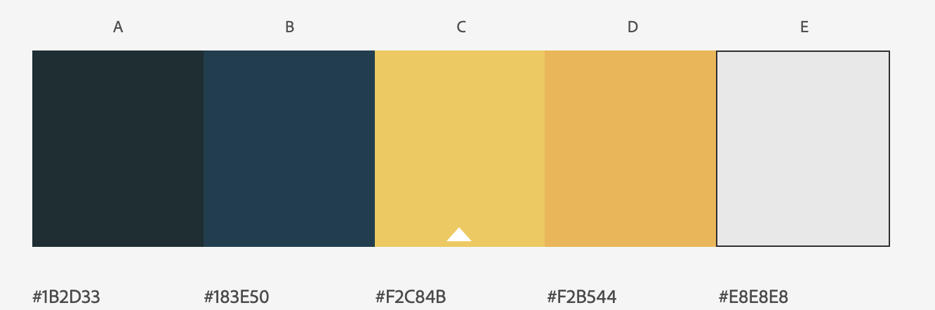
To make sure I was being thorough, I went back to accessible-colors.com to run tests on my new colors making sure to test various background and text color combinations. I started with accessibility testing to make sure I understood which color combinations were actually passed AAA standards so that I could refer back to these options when deciding background and text color.
Style guide
With my new color palette, I began on a style guide. Important stylistic aspects include:
Heavy use of gradients and drop shadows to add dimension and visual interest
Serif font for body copy for easier readability
Sans serif font for navigation, titles, and buttons for more modern feel
Custom FCC logo created on Photoshop

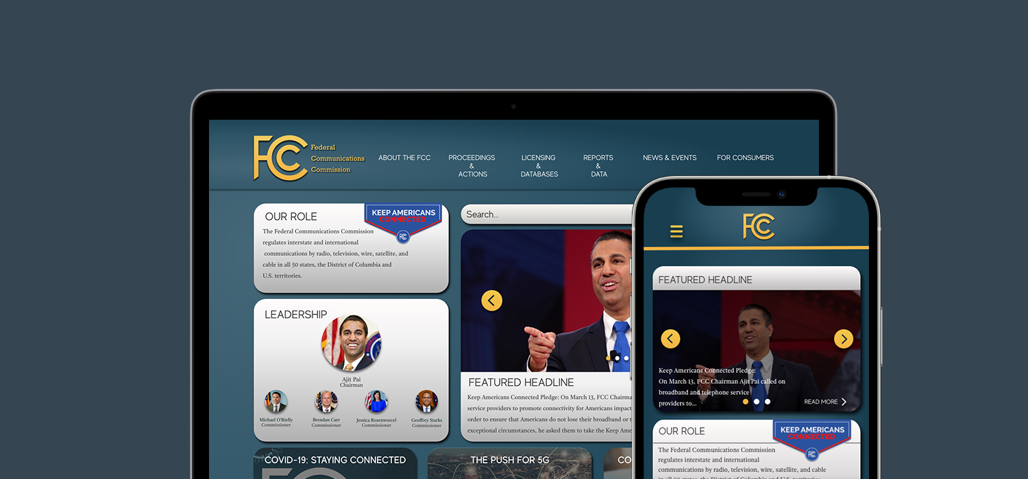
High-fidelity prototyping: Round 1
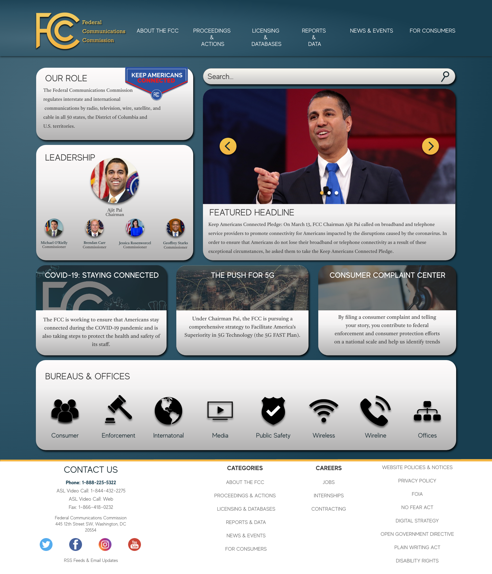
Using the style guide, I began the first iteration of my stylized desktop and mobile wireframes.


User testing: round 3
I tested the mobile prototypes on 7 users. Users frequently used to word “clean” to describe the redesign which was one of the words I had in mind for the redesign meaning my goal was achieved.
I tested the users on 3 more tasks to see if my content and visual redesign improved the usability of the FCC website.


I noted the following feedback about the 3 tasks:
Task 1: Users easily found this but noted that it would seem more natural for it to be somewhere near the top
Task 2: All users easily found this
Task 3: Most users found this easily but some noted that it should be visible on the homepage instead of being in a carousel
Using the this feedback, I was able to start on the second and final iterations of my desktop and mobile prototypes.
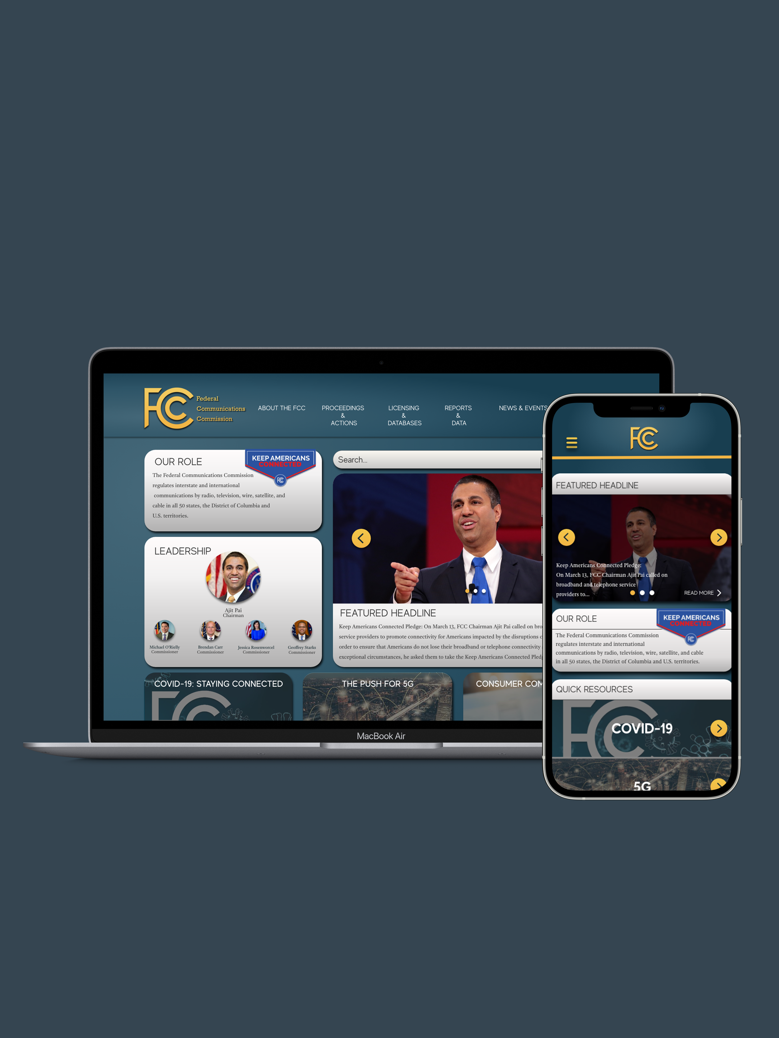
High-fidelity prototyping: round 2
I made a number of changes to the second iteration of prototypes:
Desktop
Removal of yellow lines and borders
Changed headlines to a carousel
When navigation is expanded, the top border of the content on the right side of the page aligns with the top border of the search bar for better visual harmony
Darker gradient background when navigation is expanded
Added custom FCC logo to header
Mobile
Changed “quick resources” to all be visible on homepage instead of in a carousel (based on user feedback)
Moved “our role” to the top of the homepage (based on user feedback)
Added custom FCC logo to header
Changed color of search bar to gray to match the desktop (based on user feedback)
Lighter blue overlay when navigation is expanded


TAKEAWAYS
FUTURE OPPORTUNITIES
Given I only had 2 weeks to complete this redesign, I would like to continue to build out more pages and improve upon the visual aspects of the current pages I have built out.