Lost-n-Found Website Redesign

The Lost-n-Found Youth website was redesigned to improve usability for donors, volunteers, and beneficiaries through transformation of information architecture and visual design on both mobile and desktop.
TEAM MEMBERS
Asia Asberry
Kyla Beals
Courtney Yapp
MY ROLE
User researcher
User experience designer
User interface designer
TOOLS USED
Adobe XD
Adobe Illustrator
InVision
Miro
TIMELINE
September 17, 2020 - October 1, 2020
BACKGROUND
What is Lost-n-Found Youth?
Lost-n-Found Youth (LNFY) is a nonprofit organization that works to end homelessness for LGBTQ youth by providing food, shelter and life stabilization services.
Why we chose LNFY
We were inspired to choose LNFY because it is a local organization working to uplift an at-risk and underserved community. Providing local youths with support systems and essential services to sustain and improve their lives is ultimately what pushed us to choose this organization.
PROBLEM
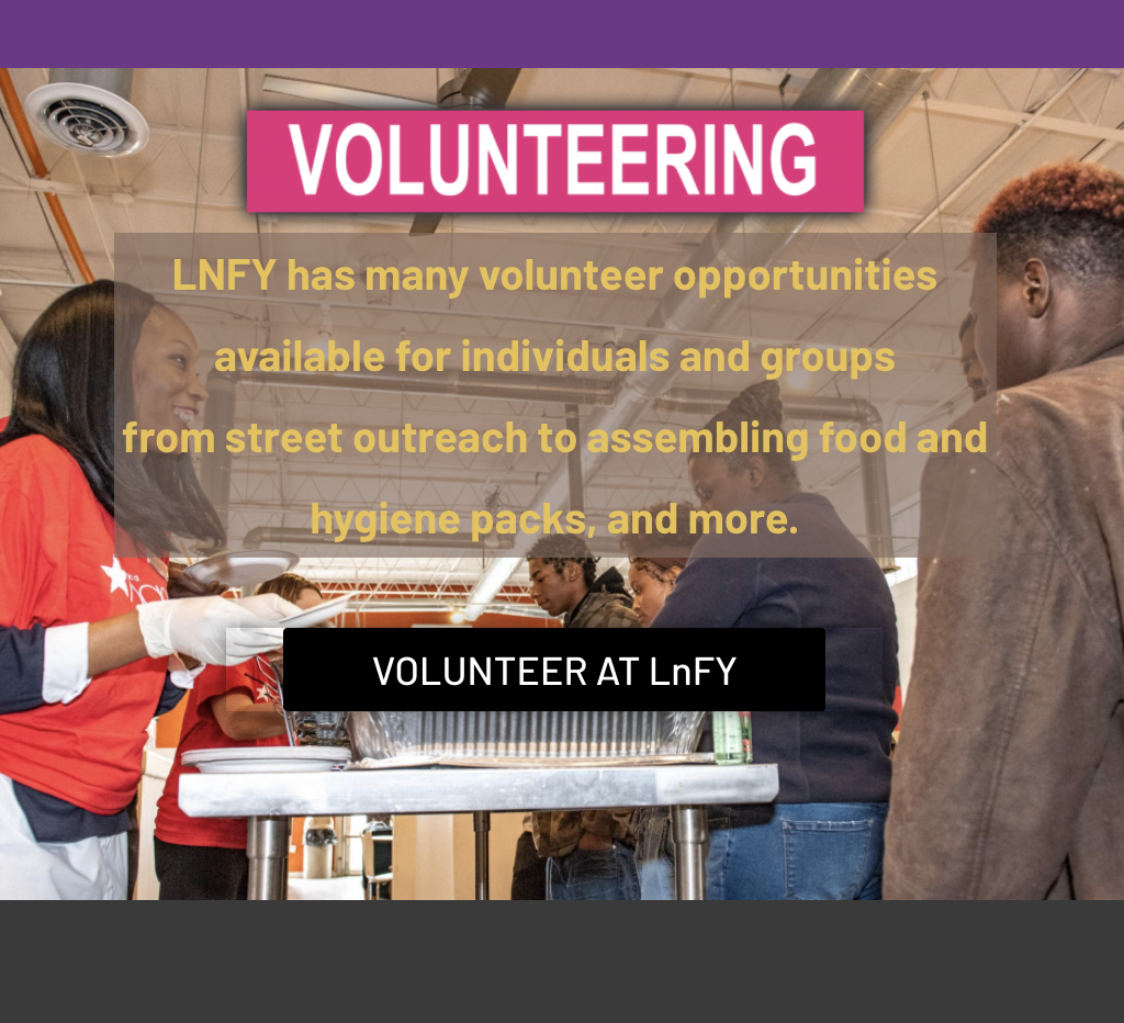
In addition to being inspired by the mission of LNFY, their desktop and mobile sites were in huge need of visual redesign due to accessibility and formatting issues and the unintuitive organization of their content.


RESEARCH

Sigele Winbush
LNFY’s PR Coordinator
Stakeholder Interview
Sigele Winbush gave valuable insights into the organization and the “clients” that were missing from the website. LNFY has many more resources and opportunities than described on the site. We also learned the “youths” refers to individuals from 18-25 years of age. Additionally, hearing her passion and fervor for the mission really inspired us.
PROTO-PERSONAS
Seeing that LNFY not only benefits those who seek out its services but also relies on financial and time contributions from donors and volunteers, we needed to make 2 proto-personas to capture the full picture so that our website could serve both populations most effectively. Our two personas were Taylor Cooper, an LGBTQ+ donor/volunteer and Ally Lewis, an LGBTQ+ teen experiencing homelessness.


LNFY Website User Tests and interviews
We tested users on 4 tasks using the original LNFY site and recorded their success rates for each task. We also took detailed notes on any verbal feedback they gave while navigating the site.
Task 1
Navigate to find ways to donate to LNFY: 62.5%
Task 2
Find the future objectives of LNFY: 75%
Task 3
Find a list of items the NFY thrift store does not accept: 50%
Task 4
Find information on how to volunteer at the youth center: 50%
The success rates for all 4 tasks were less than stellar which made it immediately clear to us that the website was not as usable as it could be.
Affinity diagram based off user feedback and task success rates
Empathy Maps
From there, we were able to hone in on what our proto-personas would need from the LNFY website by creating empathy maps using insights we collected from preliminary user interviews


IDEATION
User Insights
We began by synthesizing our notes from our user research into a few user insights for our personas, Taylor and Ally.
As a volunteer and donor, Taylor’s insights focus on the information they need from the website in order to volunteer and donate to the organization.
For Ally, as a potential beneficiary, her insights focus on finding information about LNFY’s crisis services.
Ally’s Insights
1. Ally needs quick access to the LNFY hotline number because her access to internet on her phone is inconsistent.
2. Ally needs to be connected to GED resources because she has the goal of going to college.
3. Ally seeks a positive role model because she lacks a familial support system.
Taylor’s Insights
1. Taylor needs to sign up a group to volunteer because they want to volunteer with friends for an organization they are passionate about.
2. Taylor needs to find what items they can donate to the because they may not have a money to donate at the time.
3. Taylor needs to find what LNFY is currently fundraising for because the goal can affect their donation amount.
Problem Statements
From our insights we created problem statements to focus our design direction.
We observed that youth have inconsistent access to essentials (internet, transportation, housing) which causes difficulty in establishing routines they need to achieve goals like building a reliable support system or completing their education.
We observed that Taylor has difficulty finding where their resources (time, financial, donations) are most needed which causes them to not want to share the opportunity with their friends and in turn look for a different organization
Competitor analysis
We conducted a SWOT analysis of three competitor websites, FODAC, HRC Atlanta, and Atlanta Mission. From analyzing their sites, we noted different ways that nonprofits showcase information on volunteering, donating, and their mission statements. We realized a common strength was their use of clear, ordered layouts and generous use of client testimonials.
Card Sorting
Using the current LNFY website and our user research, we identified all elements that needed to be included in the new information architecture for our re-design. We then each individually conducted our own card sort and as team reviewed and combined our work into a single card sort to lay the groundwork for designing our new website.
Final site map
MoodboardING
As a team, we collaborated on a moodboard to find UI patterns, elements and visuals that we were inspired by and could incorporate into our design. This process helped us form a common language about aesthetics and UI patterns before we started sketching and prototyping.


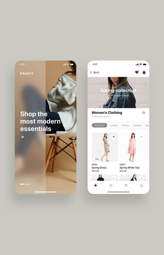
We incorporated elements from the above designs into our final prototype.
The soft rainbow gradient and frosted overlays give the designs a more modern feel while providing points of visual interest without being too overwhelming. This was important to us because the current LNFY site features heavy use of rainbows. We wanted the redesign to still feel authentic to LNFY’s brand so still incorporating rainbows but adding a frosted overlay to tone it down and provide contrast for accessibility was something we made sure to include.
We knew we wanted to include the large icons and underlines because these elements are usually used to make important information and functions stand out. Lack of visual hierarchy is an issue on the current LNFY site and we knew that was something icons and underlines could fix.
PROTOTYPE
User Flow
From our site map we then created our user flow, where we expanded upon the details in the site map to include sub-actions available on different pages. In this image, we highlighted the task flow established for Taylor, which became the basis for our usability test tasks.
User flow
Paper prototype
We then independently sketched our initial ideas for three main pages of the website. These sketches drove our conversations about layout, information organization, and visual hierarchy before we started collaborating on our low fidelity prototype.

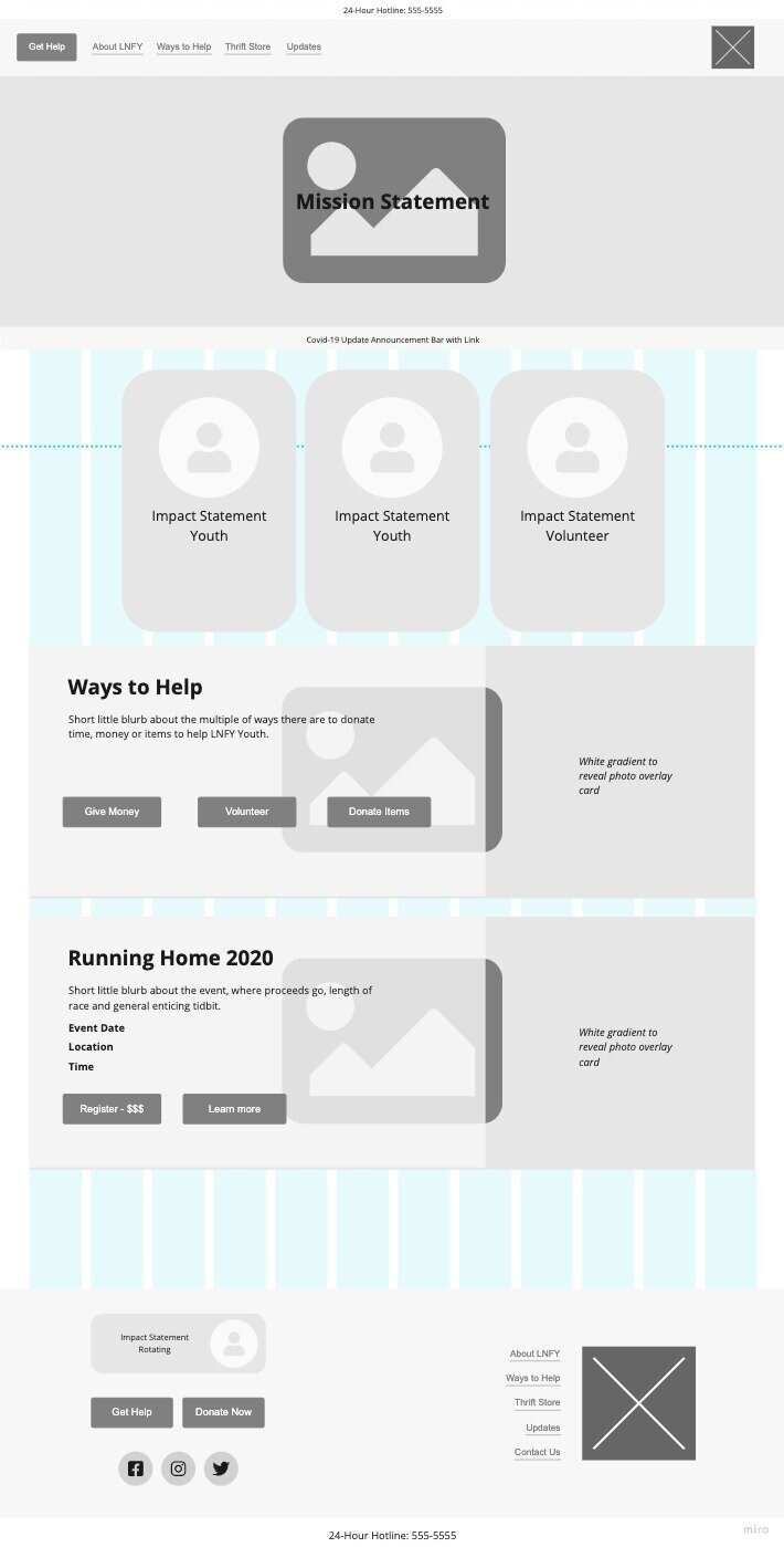


Low-fidelity wireframes
We tested our lo-fi mobile prototype using InVision. For our usability tests, we asked users to complete three tasks. Below are key insights from our tests:
Insight 1:
The wording of the volunteer button on the Thrift Store page confused users.
Insight 2:
Given our collapsible page content structure, a drop down for “About LNFY” is no longer needed.
Insight 3:
Users responded to the use of impact statements so we decided to make them more prevalent.


Style guide
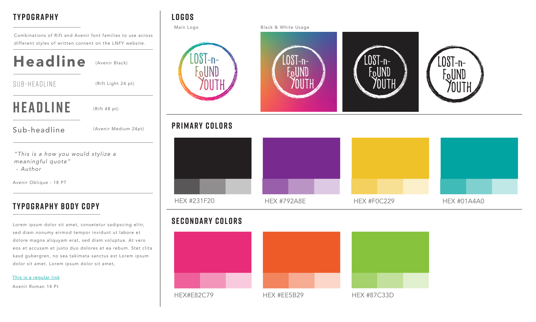
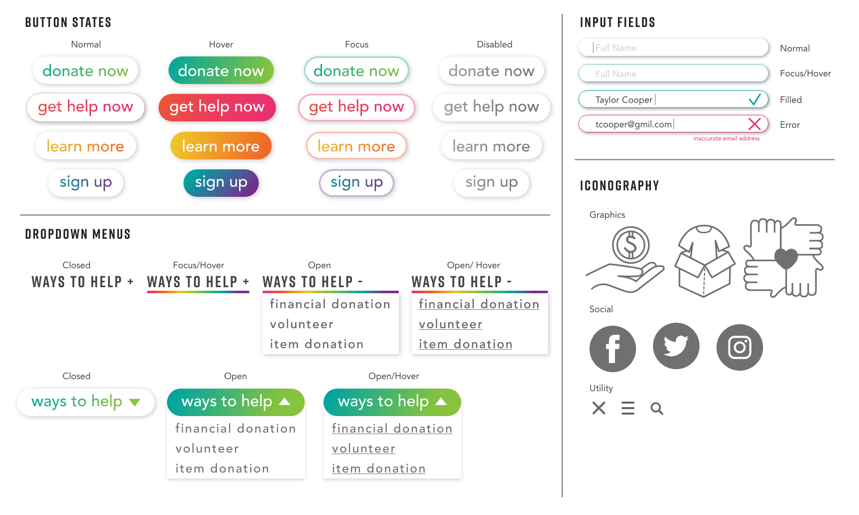
Before diving into the hi-fi prototype we built out our style guide. This helped us as a team to split up sections of the prototype to develop alongside each other.
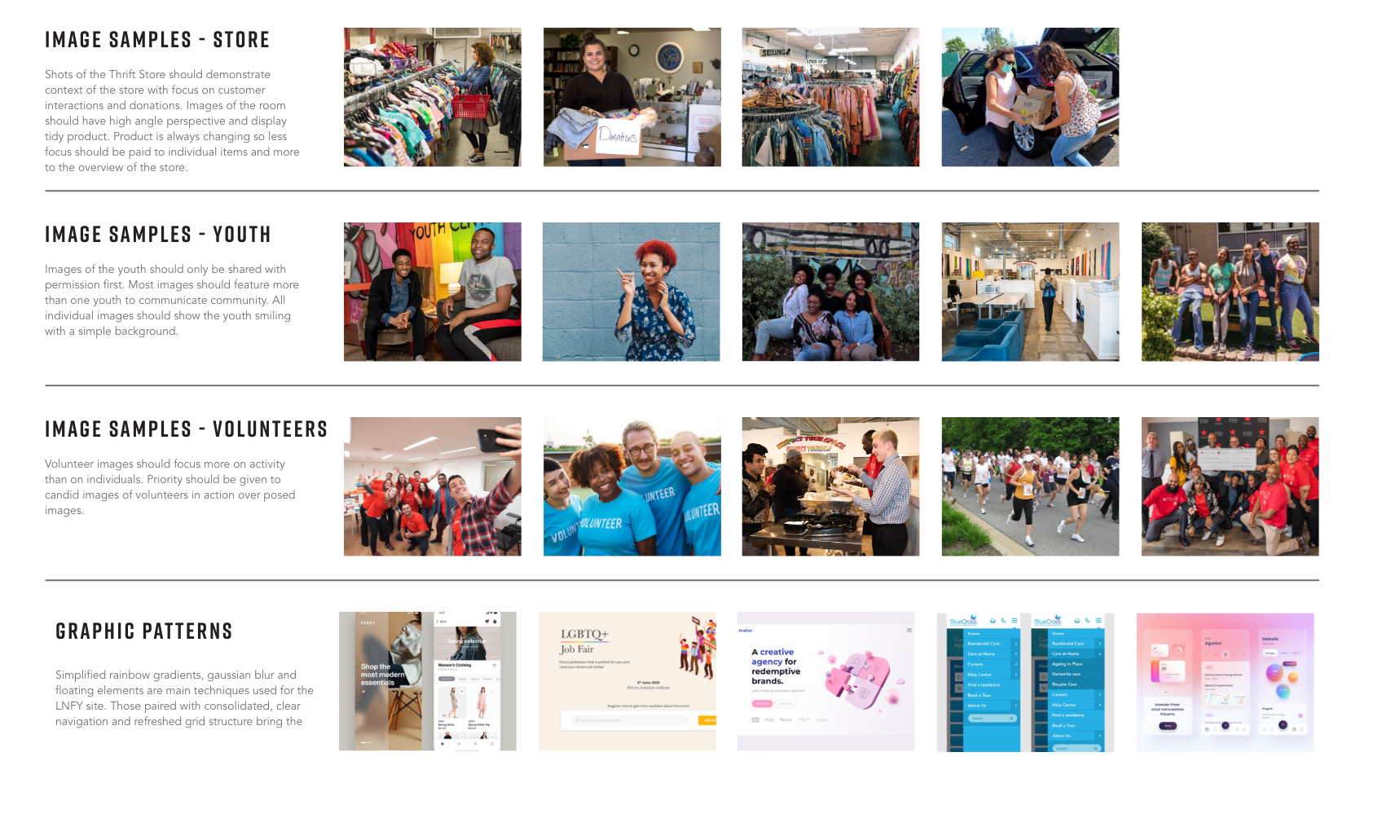
Our stakeholder, Sigele provided us with LNFY’s brand guide to help direct our color choices, image selections, and logo usage.
High-fidelity prototype
We decided to tone down the use of the rainbow color color palette to make it less harsh and more inviting. We pulled in the brighter colors for user touch points like buttons and underlines. Also, the use of cards and a more simplified navigation structure allowed us to clarify the available actions for users.
For our redesign, we:
• Utilized the “rainbow” colors in a soft gradient blur with pops of bright color on buttons and underlines to focus users attention
• Simplified the top navigation to clarify the actions a user can perform
• Repeated the hotline number and “get help now” button on top and bottom of each page
• Consolidated information into content cards for RWD
• Prioritized use of photos to demonstrate multiple facets of the organization
EVALUATION
Usability testing
The overall results of the 6 tasks in our usability test were very positive. Our lowest success rate during task 4 revealed a task flow we have previously not considered. This flow will be added in our next iteration.
Task 1
Find information on how to make a monetary donation to LNFY: 100%
Task 2
Read the first sentence of the mission statement: 100%
Task 3
Find LNFY’s strategic plan: 100%
Task 4
Read the list of items accepted by the thrift store for donation: 79%
Task 5
Find how to sign up a group to volunteer at the thrift store: 96%
Task 6
Go to the page where you can find information on LNFY’s crisis support services: 92%
TAKEAWAYS
Future opportunities
Given the lack of accessibility with the original site, we would like to further develop and test the new sites accessibility.
Next steps
My group and I along with 2 developers are currently working to bring our design into a live website to hand over to LNFY.


